Responsive vs Adaptive Design: Which One is Better?

It depends on the context and requirements of the project.
Responsive design refers to a design that adjusts to the screen size and orientation of the device used to view it, providing an optimal viewing experience for users.
Adaptive design, on the other hand, uses predefined layouts for specific screen sizes, resulting in a faster loading time, but less customization and flexibility compared to responsive design.
In general, responsive design is a better choice for projects that require more flexibility and a more consistent experience across all devices. Adaptive design is a better choice for projects with specific performance requirements, such as a need for faster load times on specific devices.
Ultimately, the choice between responsive and adaptive design will depend on the specific needs and goals of the project.
What’s Responsive Web Design?
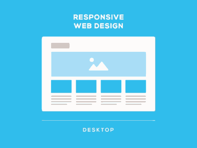
Responsive web design is a design approach that allows a website to adjust its layout and display according to the screen size and orientation of the device being used to view it. This approach provides an optimal viewing experience for users, regardless of whether they are accessing the site on a desktop computer, tablet, or smartphone. Responsive web design is achieved through a combination of flexible grid-based layouts, images, and CSS media queries, which determine how the site should be displayed on different screen sizes. The goal of responsive design is to create a seamless, consistent experience for users across all devices, without the need for separate mobile versions of a site.
What is Adaptive Design?
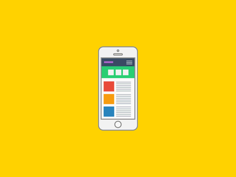
Adaptive design is a design approach in which a website is designed to display differently on specific devices, based on pre-defined layouts for each device type or screen size. Unlike responsive design, which adjusts the layout of a website dynamically based on the size and orientation of the device, adaptive design uses specific layouts optimized for each device.
Adaptive design often results in faster load times and a better performance on specific devices, as the layout is optimized for that device. However, it can also result in a less flexible and customizable experience for users, as the design is limited to a set number of predefined layouts.
Adaptive design is often used in combination with responsive design, to provide a specific optimized experience on specific devices, while still maintaining a flexible and responsive layout on other devices.
How do Responsive and Adaptive Design Compare?
Responsive and adaptive design are both approaches to designing websites that are optimized for viewing on different devices, but they differ in how they adjust to the different device types and screen sizes.
Responsive design is a fluid, flexible design approach that adjusts the layout of a website dynamically based on the size and orientation of the device being used to view it. This approach provides a consistent experience for users across all devices, but can result in longer load times and a less optimized experience on specific devices.
Adaptive design, on the other hand, uses pre-defined layouts for specific devices and screen sizes, which results in faster load times and a more optimized experience on specific devices. However, this approach can result in a less flexible and consistent experience for users, as the design is limited to a set number of predefined layouts.
Advantages of Responsive Design
Advantages of responsive design include:
- Consistent user experience: Responsive design provides a consistent user experience across all devices, ensuring that users have a seamless experience regardless of whether they are accessing the site on a desktop computer, tablet, or smartphone.
- Improved search engine optimization (SEO): Responsive design makes it easier for search engines to crawl and index a website, as it eliminates the need for separate mobile versions of a site, which can cause confusion for search engines.
- Increased mobile traffic: With more and more people accessing the internet on their mobile devices, responsive design can help increase mobile traffic to a site, as users are more likely to engage with a site that provides a good experience on their device.
- Lower development and maintenance costs: With a single design for all devices, responsive design reduces the cost of developing and maintaining separate designs for each device type, making it a more cost-effective option.
- Future-proofing: As new devices and screen sizes are introduced, responsive design will automatically adjust to accommodate them, ensuring that the site remains optimized for users regardless of the devices they use to access it.
Advantages of Adaptive Design
Advantages of adaptive design include:
- Faster load times: Adaptive design can result in faster load times, as the layout is optimized for specific devices and screen sizes, and the device only loads the content and assets it needs to display the site correctly.
- Improved performance on specific devices: Adaptive design provides a better performance on specific devices, as the layout is optimized for those devices, resulting in a more optimized experience for users on those devices.
- More control over the layout: With adaptive design, there is more control over the layout of the site, as specific layouts are created for each device type or screen size. This allows for a more optimized experience for users on specific devices.
- Greater design options: Adaptive design provides greater design options, as the design can be optimized for specific devices and screen sizes, rather than being limited by the constraints of a responsive design.
- Simplified testing and debugging: Testing and debugging an adaptive design is often easier, as it only needs to be tested on a limited number of specific devices and screen sizes, rather than a wide range of devices as with responsive design.
When to Use Adaptive Design?
Adaptive design is best used when:
- Optimizing performance for specific devices: If you want to optimize the performance of your site on specific devices, such as tablets or smartphones, adaptive design may be a better choice as it provides a more optimized experience for users on those devices.
- Faster load times: If faster load times are a priority for your site, adaptive design may be a better choice as it results in faster load times, as the layout is optimized for specific devices and screen sizes, and the device only loads the content and assets it needs to display the site correctly.
- Greater control over the layout: If you want greater control over the layout of your site, adaptive design may be a better choice, as specific layouts can be created for each device type or screen size, resulting in a more optimized experience for users on specific devices.
- Design-specific needs: If your design needs are specific to certain devices or screen sizes, adaptive design may be a better choice, as it provides greater design options, allowing you to optimize the design for specific devices and screen sizes.
- Limited device types: If your audience primarily uses a limited number of device types, such as smartphones or tablets, adaptive design may be a better choice, as it provides a more optimized experience for users on those devices, while simplifying the testing and debugging process.
Conclusion
In conclusion, both responsive and adaptive design have their own advantages and disadvantages, and the choice between the two ultimately depends on the specific needs and goals of a project.
Responsive design provides a consistent user experience across all devices and is easier to maintain, but can result in longer load times and less control over the layout.
Adaptive design provides a faster performance on specific devices and greater control over the layout, but can be more complex to develop and maintain.
When deciding between responsive and adaptive design, it’s important to consider factors such as the target audience and devices, the goals for the site, and the available resources for development and maintenance.
Know More:
Website Designing Company in India
Responsive Website Designing Company in India
Static Website Designing Company in India


ReplyDeleteMobile App Development
Software Development
Web Development
Web Design
Digital Marketing Agencies
SEO
IT Services Companies
Magento Development
Shopify Developers
PPC
Social Media Marketing
Offshore Software Development
Wordpress Development
Node js Development
Angular.js Development
React.js Development
Vue js Development
eCommerce Development
eCommerce App Development
Android App Development
Top Enterprise Mobile App Development Companies
Google Adwords
Facebook Marketing, Instagram Marketing
PHP Development
Managed IT Services
Website Development
IT Strategy Consulting
ReplyDeletePost Free Ads, Website Directory, Directory Submission
Free Listing, Free Web Directory Submission, Free High DA Directory
Free classified ad posting, Free Link Directory
Free blog posts, Ad Posting
Local news, Breaking News, Technology News
Nice blog
ReplyDeleteI am really impressed by reading this blog.
Admylisting.com, Classifieds in India
Blog Commenting